UC Berkeley | haas school of business
MBA for Working Professionals
First Person partnered with the Haas School of Business at UC Berkeley to produce an eye-catching brochure. Taking a cue from the character of Berkeley and the details of the campus, I designed a booklet that broke with convention, much like the school itself.
First Person partnered with the Haas School of Business at UC Berkeley to produce an eye-catching brochure. Taking a cue from the character of Berkeley and the details of the campus, I designed a booklet that broke with convention, much like the school itself.
First Person partnered with the Haas School of Business at UC Berkeley to produce an eye-catching brochure. Taking a cue from the character of Berkeley and the details of the campus, I designed a booklet that broke with convention, much like the school itself.
First Person partnered with the Haas School of Business at UC Berkeley to produce an eye-catching brochure. Taking a cue from the character of Berkeley and the details of the campus, I designed a booklet that broke with convention, much like the school itself.
First Person partnered with the Haas School of Business at UC Berkeley to produce an eye-catching brochure. Taking a cue from the character of Berkeley and the details of the campus, I designed a booklet that broke with convention, much like the school itself.
Print Brochure Design
Print Brochure Design
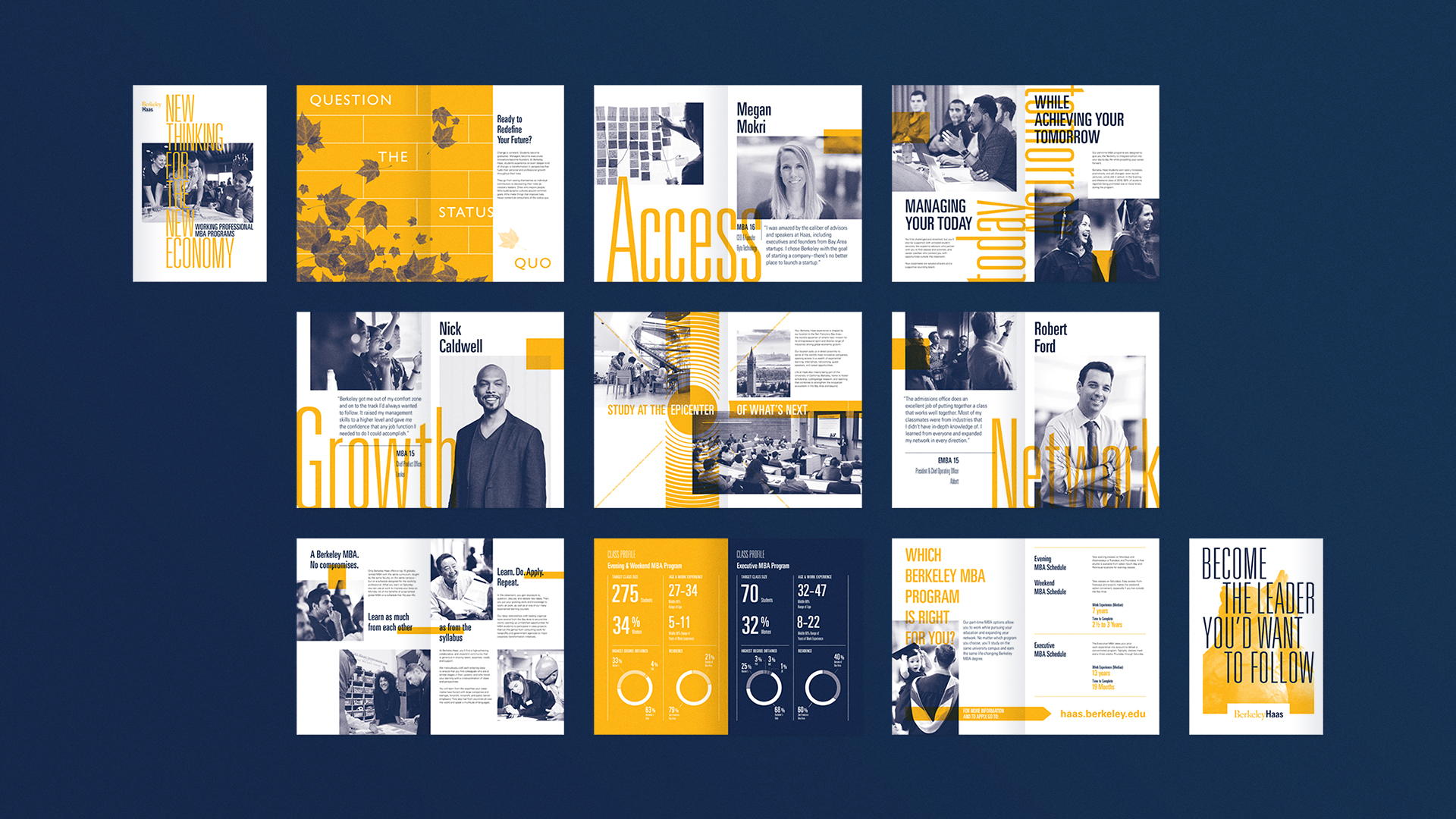
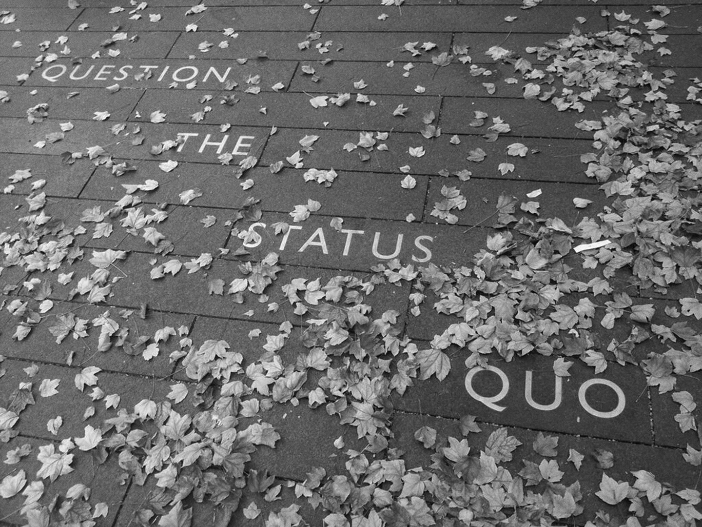
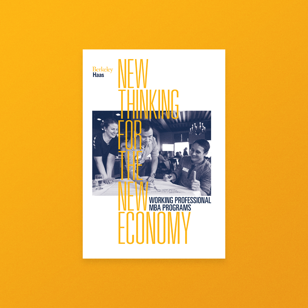
BerkeleyHaas knew it didn't want to make a “typical MBA program brochure.”
Rather, they wanted to convey the spirit of energy, dynamism, confidence, cutting edge culture and essential "offbeatness" for which Berkeley is known.
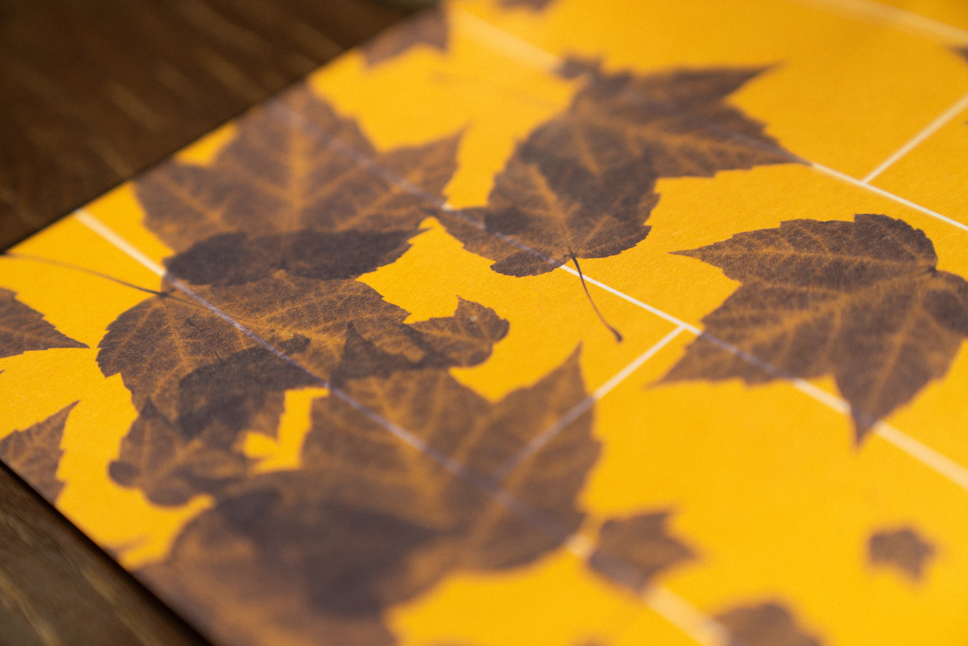
Our source of inspiration came from decidedly non-business school references like film festival and museum programs, and while walking the campus I was inspired to incorporate details—both natural and engineered—into the design.
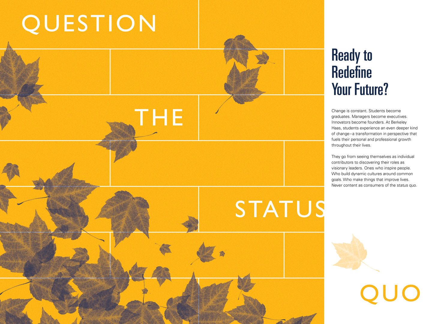
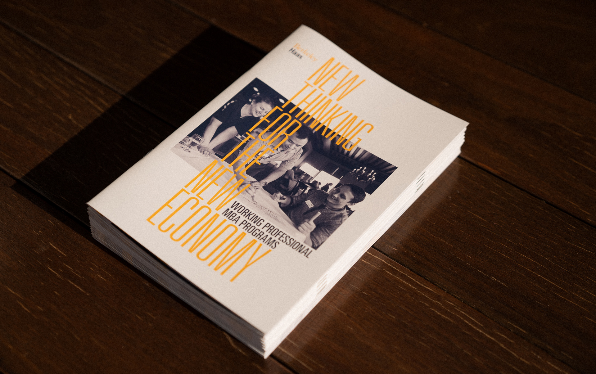
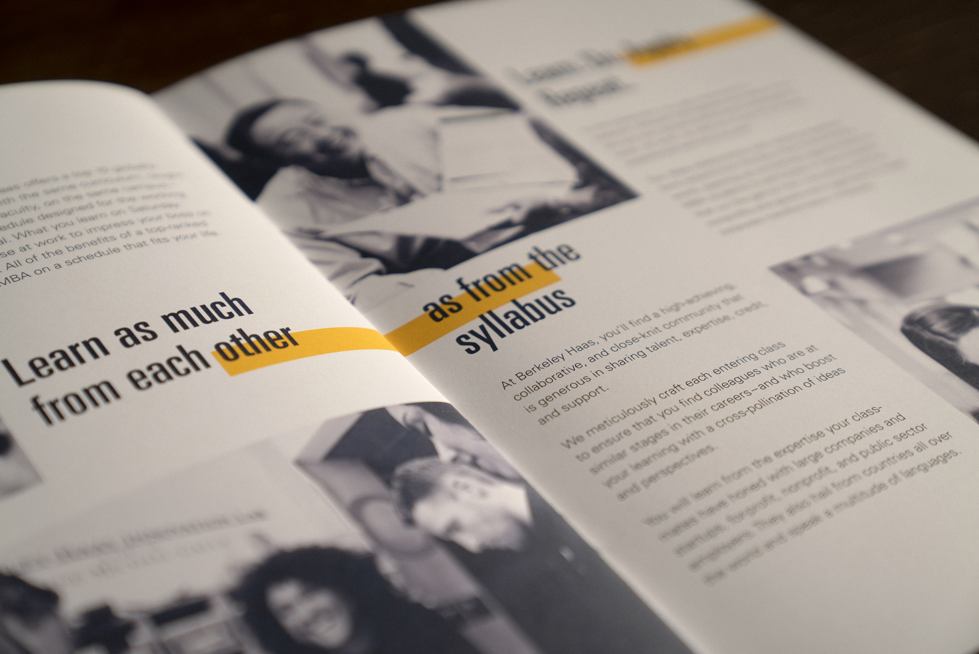
While the color palette stayed restrained to the solid navy and brilliant gold UC Berkeley is known for, I encouraged them to push the range of typography that was commonly used.
The BerkeleyHaas brand font—Univers—is frequently only used in two weights (55 Regular and 65 Bold). I wanted to explore the more extreme ends of Adrian Frutiger's quintessential type system and incorporate the Ultra Condensed weights. Their striking verticality perfectly complimented the themes of strength, empowerment and leadership on which the program is founded.
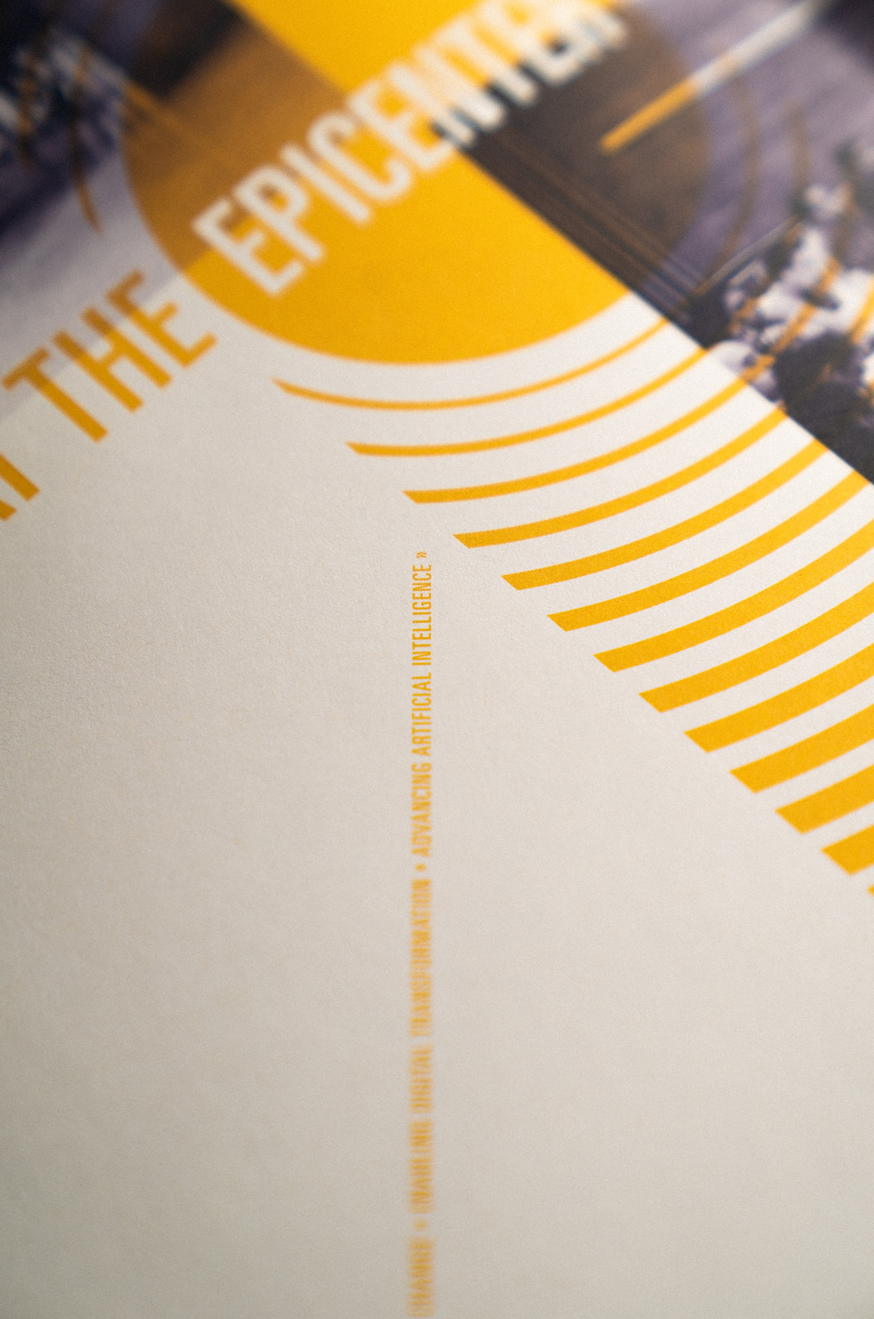
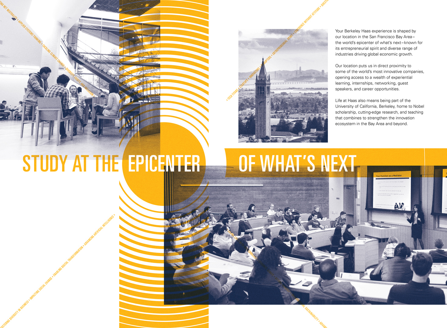

The brochure was printed on a natural uncoated paper with just enough surface grain to encourage touch. It was important to retain a hint of the earthy, edgy quality of Berkeley, a city characterized by texture—both the organic and man-made textures of the city and surrounding ecology, and the metaphorical texture of ideas, philosophies, and diverse worldviews the city and school are renowned for.

My Role
Layout & Art Direction
Agency
First Person
Creative Director
Vanessa Greene
Project Manager
Jackie Yea Starrett
Printing
Fong & Fong Printers
Contact
©
© Casimir Fornalski 2010 – 2021
Casimir Fornalski
© Casimir Fornalski 2010 – 2021
2026
© Casimir Fornalski 2010 – 2021
