Monstrum Media
Logo & Graphic Design
Sharp and assertive logo for a musical synth software company.
Sharp and assertive logo for a musical synth software company.

Rob Wentz has been writing industrial and electronic music for over two decades as a part of the group Monstrum Sepsis. In 2013, he asked me to design a logo for his company Monstrum Media, a developer of software editors for synthesizers.
MMM…
The name Monstrum Media has no fewer than three "m"s, which created a fun alliteration that lent itself to a graphic device. I hit upon the idea to fuse the three Ms into one object. Depending on how you look at it, this became an unholy typographic colossus, or a cool and imposing icon that complimented the goth/industrial roots of the band Monstrum Sepsis and the synth scene the software appeals to.
MMM…
The name Monstrum Media has no fewer than three "m"s, which created a fun alliteration that lent itself to a graphic device. I hit upon the idea to fuse the three Ms into one object. Depending on how you look at it, this became an unholy typographic colossus, or a cool and imposing icon that complimented the goth/industrial roots of the band Monstrum Sepsis and the synth scene the software emerged from.
The logo also none-too-subtly invokes the hardware elements of synthesizers: narrow black and white keys, vertical columns of knobs and dials, and different audio channels running in parallel. The wordmark, set in DIN, complements the angular austerity of the icon with its uniform stroke weights and no-nonsense lowercase.
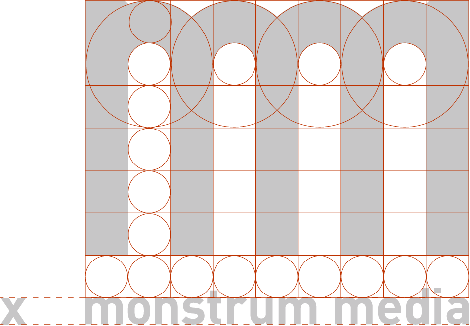
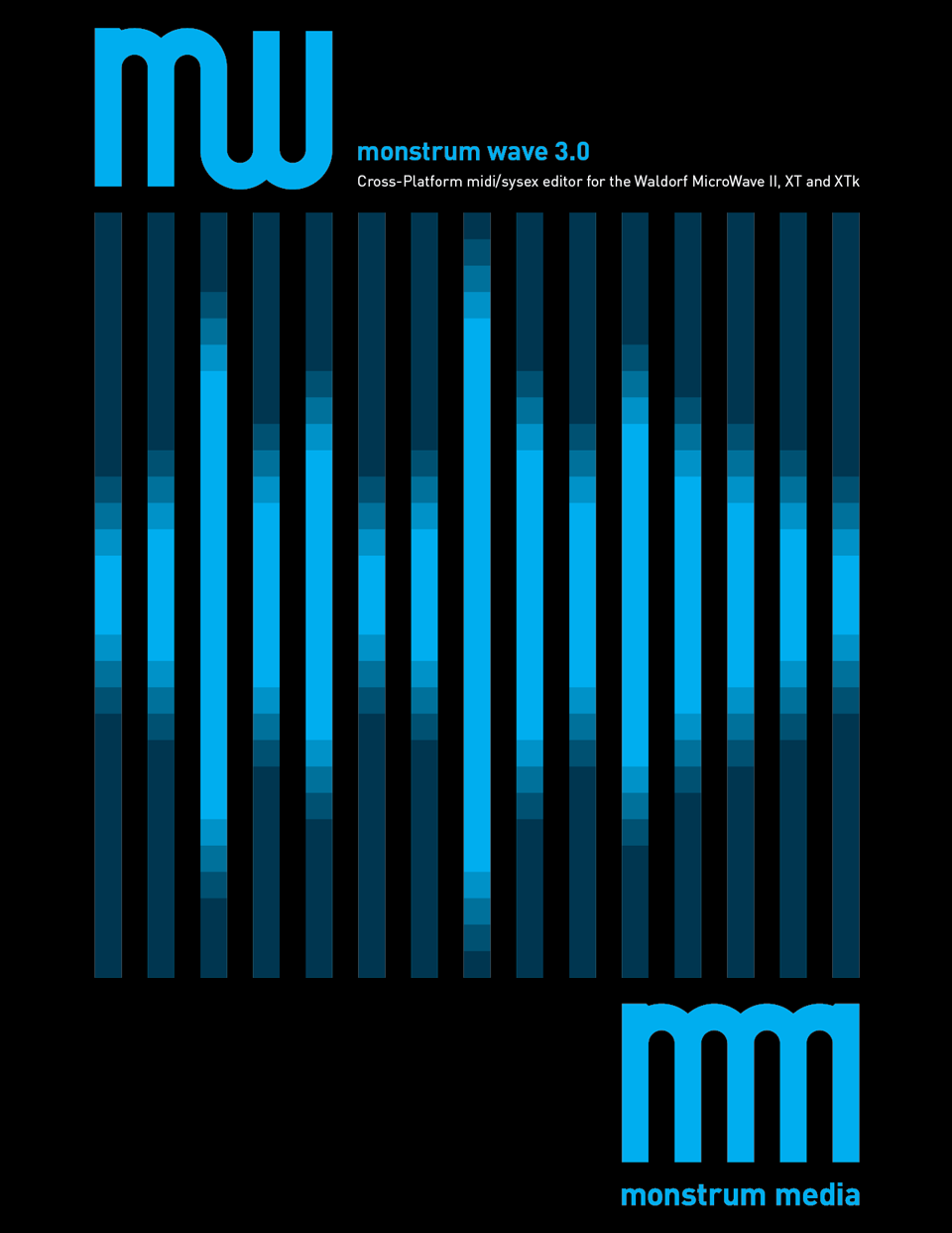
The linear and geometric construction of the logo allowed it to be modified and adapted for individual product names.
It also informed the design of manual covers for the software.
Type
Type
Type
Type
© Casimir Fornalski 2010 – 2024
© Casimir Fornalski 2010 – 2021