Omnicell
Rebrand 2020
After twenty-five years, the prominent health care technology company sought to reinvent itself as a key architect of Autonomous Pharmacy. As Senior Art Director at First Person, I led a team in developing a new visual identity that conveyed Omnicell’s vision of an efficient, modern and error-free approach to patient care and medication delivery.
After twenty-five years, the prominent health care technology company sought to reinvent itself as a key architect of Autonomous Pharmacy. As Senior Art Director at First Person, I led a team in developing a new visual identity that conveyed Omnicell’s vision of an efficient, modern and error-free approach to patient care and medication delivery.
After twenty-five years, the prominent health care technology company sought to reinvent itself as a key architect of Autonomous Pharmacy. As Senior Art Director at First Person, I led a team in developing a new visual identity that conveyed Omnicell’s vision of an efficient, modern and error-free approach to patient care and medication delivery.
After twenty-five years, the prominent health care technology company sought to reinvent itself as a key architect of Autonomous Pharmacy. As Senior Art Director at First Person, I led a team in developing a new visual identity that conveyed Omnicell’s vision of an efficient, modern and error-free approach to patient care and medication delivery.
After twenty-five years, the prominent health care technology company sought to reinvent itself as a key architect of Autonomous Pharmacy. As Senior Art Director at First Person, I led a team in developing a new visual identity that conveyed Omnicell’s vision of an efficient, modern and error-free approach to patient care and medication delivery.
Visual Identity, Branding
Visual Identity, Branding
01 — Logo
Traditionally a medication dispensing cabinet company, Omnicell » knew it needed to start from the ground up as they underwent a major pivot into fully autonomous pharmaceutical implementation. Their new logo had to convey several parallel ideals that spoke to a bold vision of how the health care industry would be radically transformed through the use of AI, robotics, and intelligent software integration.
Before
After
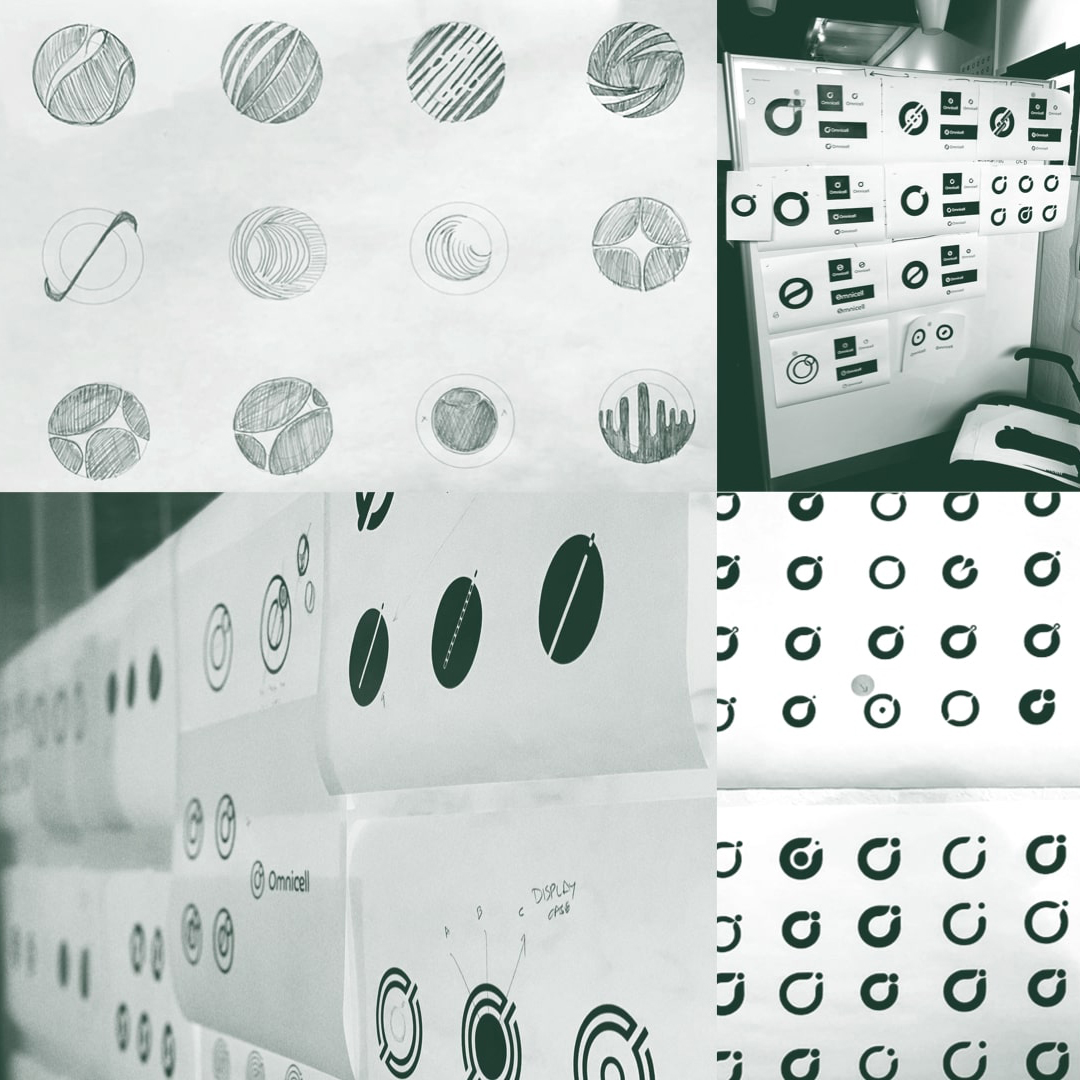
“O” Exploration
“O” Exploration
For several months we cycled through many, many iterations of a distinct mark that would signify Omnicell. One thing that was decided early on was that the mark should be anchored in the solid and omnipresent capital “O”.
For several months we cycled through many, many iterations of a distinct mark that would signify Omnicell. One thing that was decided early on was that the mark should be anchored in the solid and omnipresent capital “O”.
Brand Pillars
While I oversaw the visual design team, First Person’s creative strategists helped Omnicell craft and distill the company’s vision down into four key pillars. These pillars would each find their way into the DNA of the logo and identity.

The symbol had to work in conjunction with a distinct wordmark. We arrived at Co Headline » for the logotype fairly early. All who saw it agreed it possessed a perfect balance of technical geometry and inviting friendliness, nether too severe nor too aloof.
The Omnicell logo then became a direct construct of Co’s capitol “O”, unifying both symbol and wordmark with the same geometry.

02 — Typography

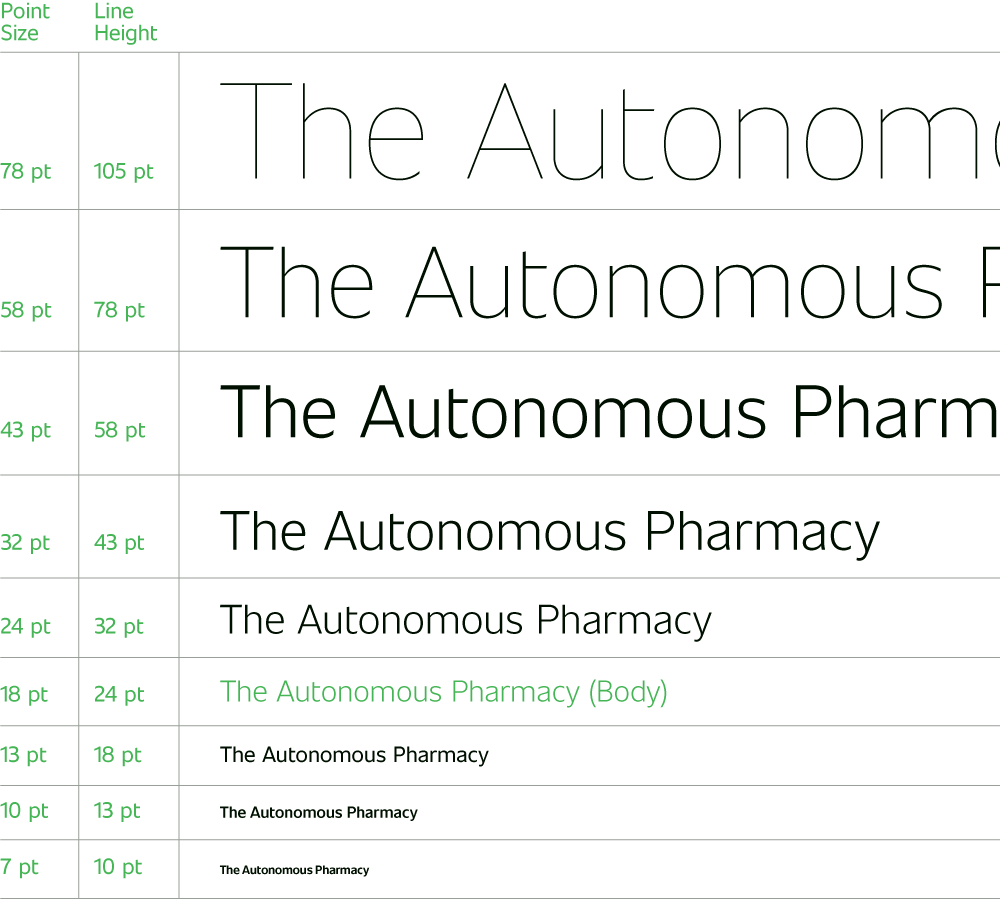
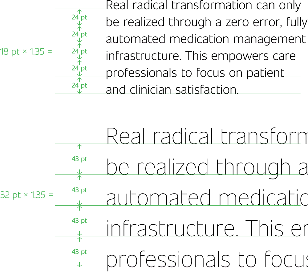
A New Face
While a new logo would provide the most immediate visual pivot for the company, the true workhorse of the brand refresh would come through the selection of an entirely new typeface. Co Headline was the right fit for the wordmark, but we agreed there had to be a separate primary text face that carried Omnicell's messaging with clarity, conviction and authority.
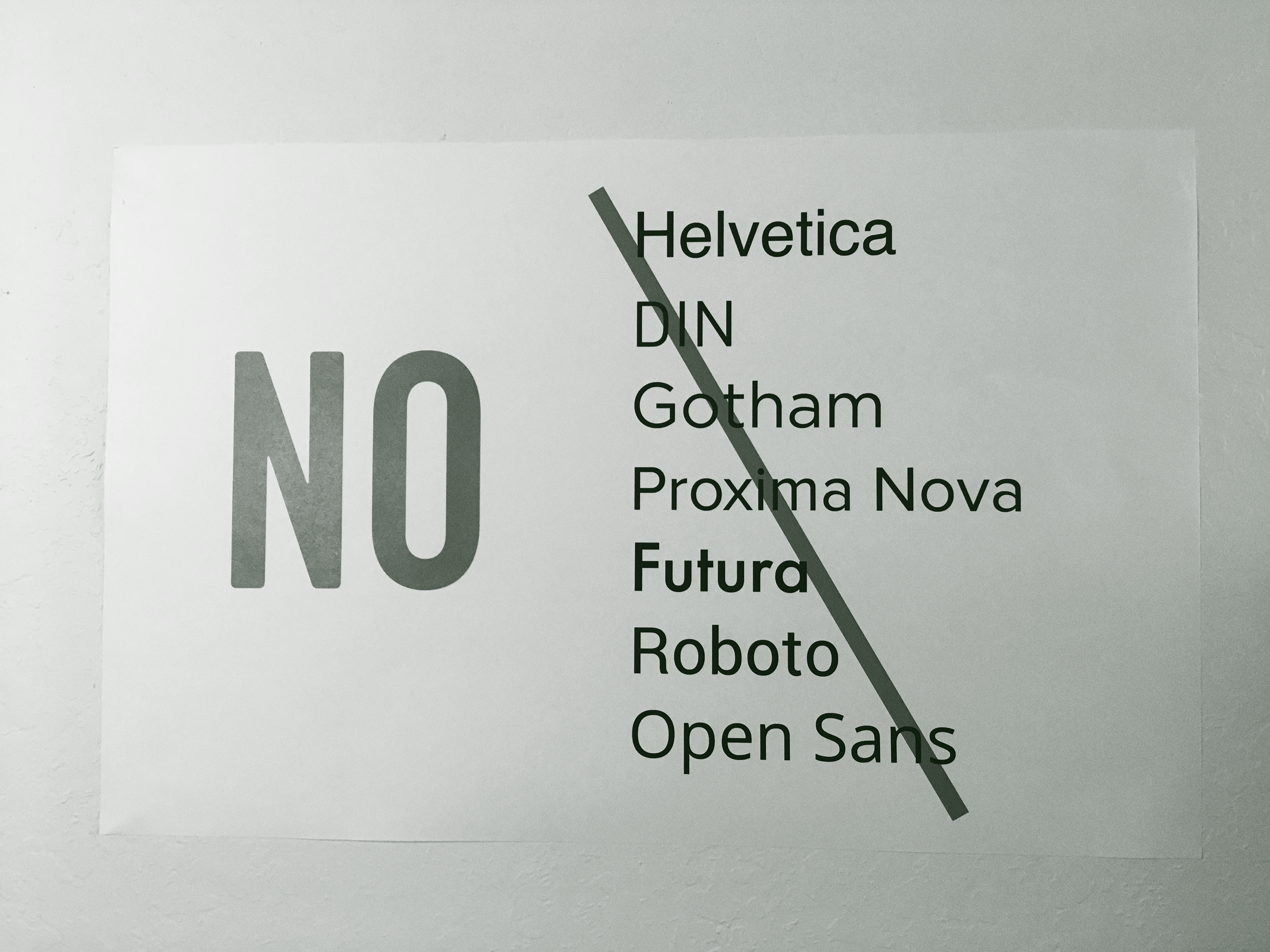
Off the Table
We put this up on the wall of the studio early on in the type exploration phase. It’s important to stress that this was not a commentary on the quality of any of these typefaces—we were fans of all and had used them in many projects. Too many, in fact.
What was agreed upon by pretty much everyone was that Omnicell needed a distinct brand face that we hadn't seen in wide usage. It had to be applicable to enterprise level communications, user interfaces, packaging labels, all while maintaining a balance between authority and accessibility.
Commissioning a bespoke typeface was not an option, and we knew that somewhere out there was a new extensive face we could license.
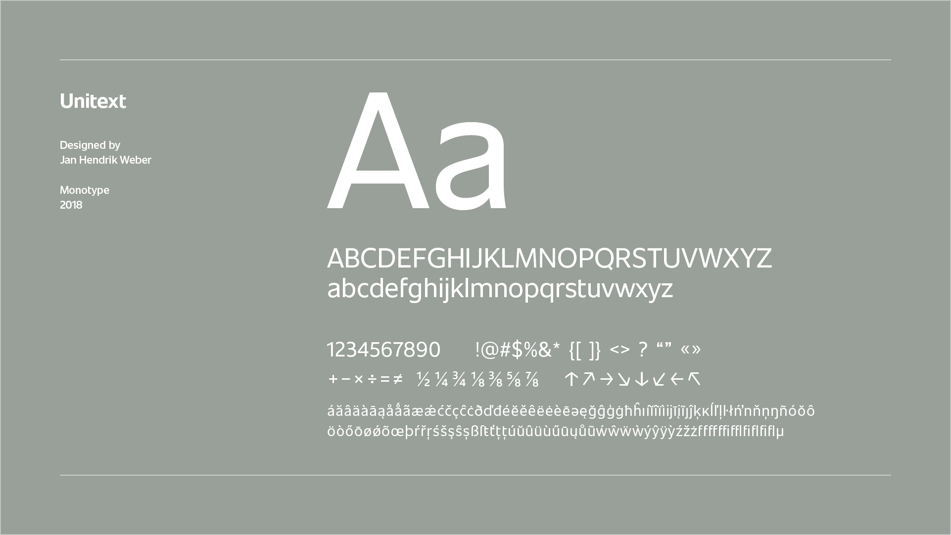
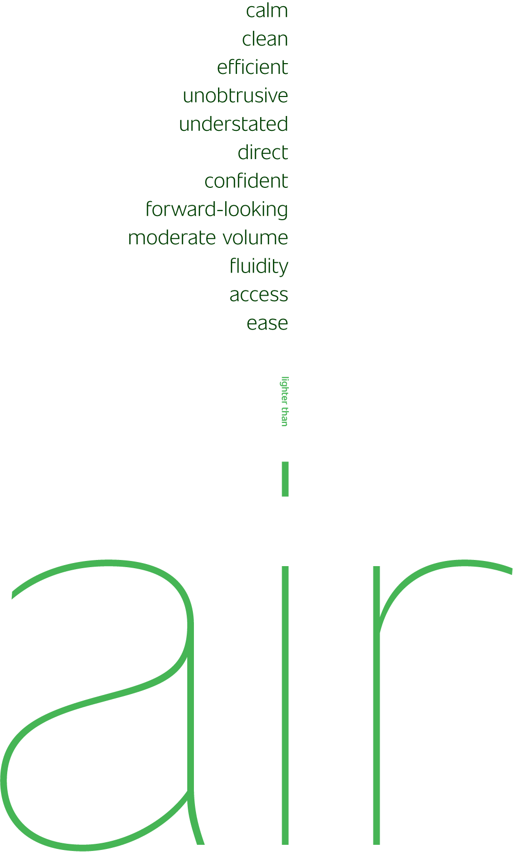
Our long search led us to Unitext », an extensive neo-grotesque whose wide range of characters, fluid curvature, generous counterspaces and rigid confidence felt just right.
The type was considered to carry the brand’s “bedside manner”, a tone and temperament that conveyed strength, authority, grace, empathy and expertise in every line.
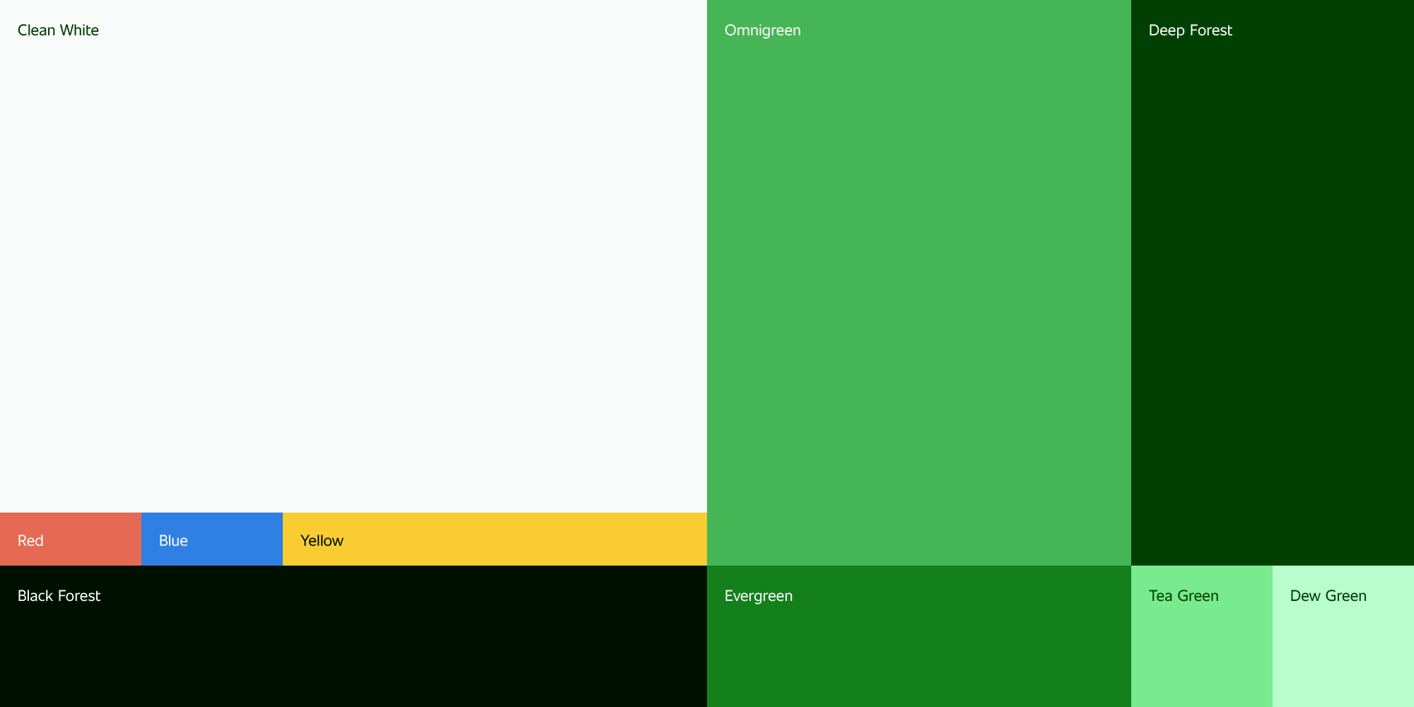
03 — Color & Pattern

Omnichrome
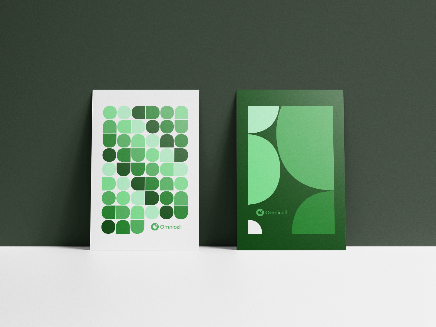
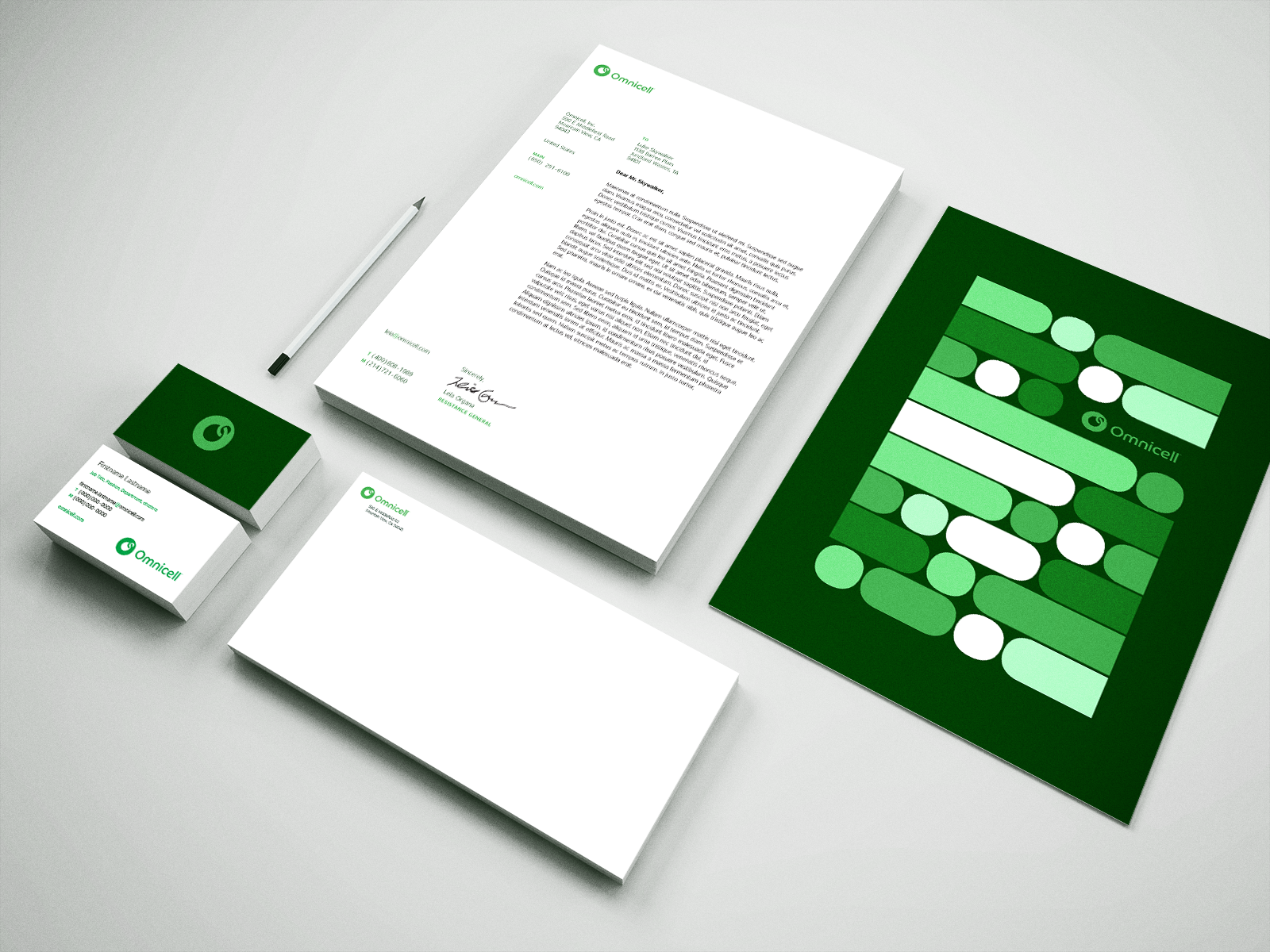
Rounding out the identity was a new color system—Omnichrome—and a framework for expressive pattern geometry.
Prior to the rebrand, Omnicell’s signature color was a bright neon green. Much of the health care field was rooted in blues and reds as primary brand colors, so Omnicell wanted to retain that hallmark of its identity to stand apart from the pack.
We updated the key green at the center of the palette—now called Omnigreen—and built out a sequence of verdant dark and light hues that invoked life in full bloom around it. These greens would contrast nicely with a netural white field as foundation.
Omnichrome
Rounding out the identity was a new color system, Omnichrome, and a framework for expressive pattern geometry.
Prior to the rebrand, Omnicell’s signature color was a bright neon green. Much of the health care field was rooted in blues and reds as primary brand colors, so Omnicell wanted to retain that hallmark of its identity to stand apart from the pack.
We updated the key green at the center of the palette—now called Omnigreen—and built out a sequence of verdant dark and light hues that invoked life in full bloom around it. These greens would contrast nicely with a netural white field as foundation.
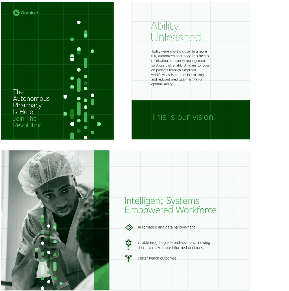
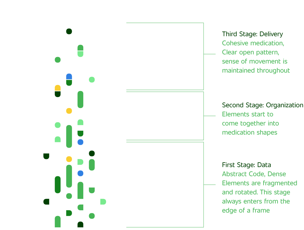
The Superellipse
In the same vein as the logo, the basis for Omnicell’s pattern geometry came from the shape of the glyphs themselves.
Situated in the center of the wordmark, we crafted the atomic base of the pattern—the superellipse. Not quite a circle, not quite a square, but a distinctive shape that lent itself to suggestions of tablets, capsules, and other pharmaceutical forms with a soft and inviting curvature.


Everything in its Right Place
As a scaffold to the flowing curves of the superellipse, we structured Omnicell’s layout and graphic identity around precise square grids. Taking a cue from the company's hardware and industrial design, grids became an important signifier of order, predictability, reliability and purpose.


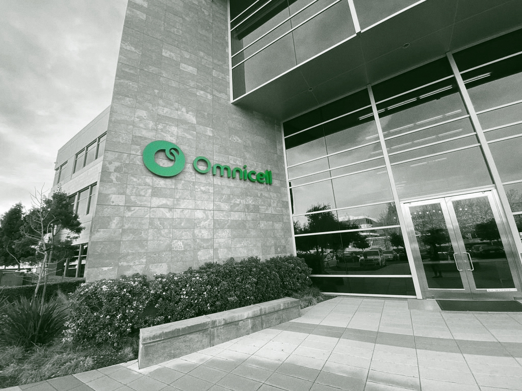
Corporate HQ, Mountain View CA
My Role
Senior art director
Agency
First Person
Executive Creative Director
Marcello Grande
Creative Directors
Tony Welch
John Stewart
Project Managers
Maria Mraz
Lauren Lindberg
Marc Tamo
Melissa Aiello
Designers
Winston Struye
Silas Reeves
Geoff Ahmann
Brian Ho
Contact
©
© Casimir Fornalski 2010 – 2021
Casimir Fornalski
© Casimir Fornalski 2010 – 2021
2026
© Casimir Fornalski 2010 – 2021
